Data Source & Purpose of Data Analysis
Data Source: Movie Industry dataset from kaggle
Purpose of Data Analysis : What movie features correlates to its gross earning?
If you want to see this project from github, please click this Link
1. Prepare Data
1.1 Import Libraries and Data
# Import libraries
import pandas as pd
import seaborn as sns
import os

import matplotlib
import matplotlib.pyplot as plt
plt.style.use('ggplot')
from matplotlib.pyplot import figure

%matplotlib inline
matplotlib.rcParams['figure.figsize'] = (12,8) # Adjusts the configuration of the plots we will create

# Read in the data

pwd = os.getcwd()
filepath = pwd + "\\movies.csv"
df = pd.read_csv(filepath)
1.2 Explore Data
# Let's look at the data
df.head()
2. Clean Data
2.1 Deal with missing data
# Let's see if there is any missing data

for col in df.columns:
    print(df[col].isnull().value_counts(), "\n")
# Drop rows with missing data

df = df.dropna()
2.2 Organize the data types
# Data types for our columns

df.dtypes
# Change data type of columns

df['budget'] = df['budget'].astype('int64')
df['gross'] = df['gross'].astype('int64')
df['runtime'] = df['runtime'].astype('int64')
# Split the string to seperate only dates
new = df['released'].str.split(" \(", n = 1, expand = True)
df['released_date'] = new[0]
# Convert the datatype to datetime
df['released_date'] = pd.to_datetime(df['released_date'])
df['released_date']

3. Analyze and Visualize the data
3.1 Scatter Plot 1 - Budget vs Gross earning
# Scatter plot

plt.scatter(x=df['budget'], y=df['gross'])
plt.title('Budget vs Gross Earnings')
plt.xlabel('Budget for Film')
plt.ylabel('Gross Earnings')
plt.show()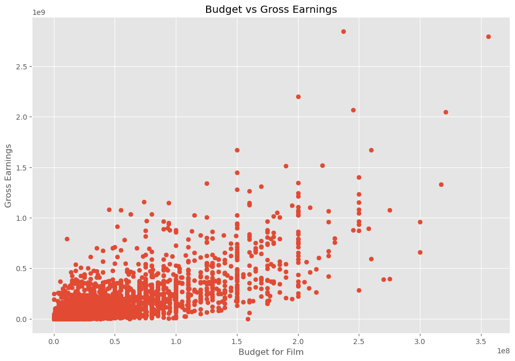
3.2 Scatter Plot 2 - Budget vs Gross earning
# Plot budget vs gross earnings using seaborn

sns.regplot(x='budget', y='gross', data=df, scatter_kws={"color":"red"}, line_kws={"color":"blue"})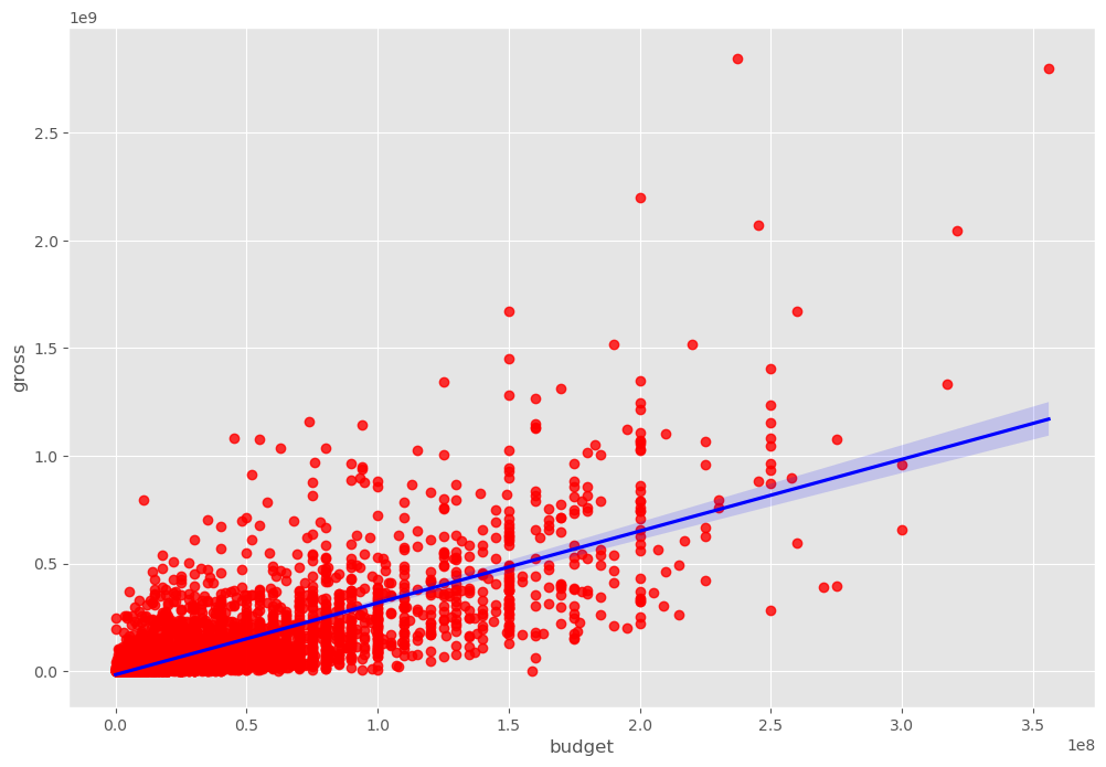
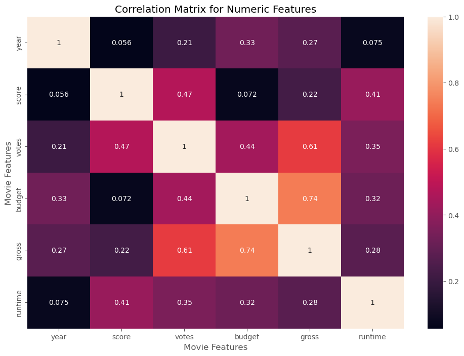
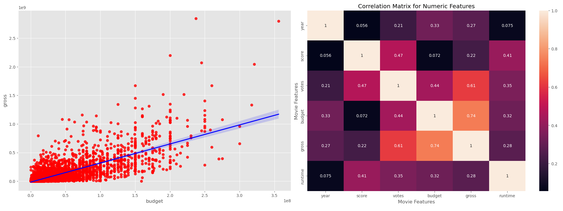
3.3 Scatter Plot - Correlation between movie features
# Let's start looking at correlation

df.corr()
# High Correlation between budget and gross

correlation_matrix = df.corr(method='pearson')

sns.heatmap(correlation_matrix, annot=True)

plt.title('Correlation Matrix for Numeric Features')
plt.xlabel('Movie Features')
plt.ylabel('Movie Features')

plt.show()